











The method ended up producing a tool.
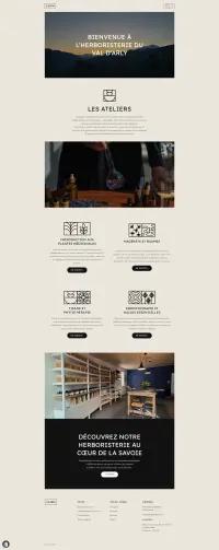
After redoing the same scale calculations on every project, I turned them into a system. EVA CSS varies sizes, typography and spacing continuously, with no steps: 99% fewer breakpoints, and a mockup that holds from the smallest screen to the largest. It is open source, and it sizes the very page you are reading.
See EVA CSS